Personalization, scrollytelling, data storytelling, and buttonless UIs are some of the most exciting 2023 UI design trends. Our research has also noticed an interesting trend toward larger screens, with Instagram improving its desktop experience to accommodate the growing demand.
Create high-quality, fully functioning prototypes to test your UI design ideas with UXPin. Sign up for a free trial to explore UXPin’s advanced features today!
Build advanced prototypes
Design better products with States, Variables, Auto Layout and more.Try UXPin

Table of Contents
[SHOW]
- Product Personalization
- Enhanced Cross-Platform User Experiences
- Scrollytelling
- Data Storytelling
- Minimalism
- Buttonless User Interfaces
- VR & AR UI Design
- Minimum Lovable Product (MLP)
- 2023 Typography Trends
- Advanced Microinteractions & Animations
Product Personalization
Personalization has grown in popularity during 2021/22–and no, that doesn’t mean simply adding someone’s name to a user interface. Companies use first and third-party data to create personalized user experiences based on user behavior and browsing habits.
A great example of product personalization is Netflix. No two accounts look alike because the algorithms suggest programming based on your viewing history. eCommerce giant Amazon uses a similar approach, personalizing each shopper’s homepage based on purchase and browsing history.
Infosys uses four elements to summarize product personalization:
- Persona: Who is your customer?
- Product Recommendation: What do you offer, and how do you present your products and services?
- Product Pricing: What is your ideal price point?
- Product Positioning: How do you position the product to customers at each stage in the sales funnel?
Product personalization resources:
- User Experience and Personalization in Digital Products
- Product Personalization – The Present and the Future
- Personalization in Digital Marketing: What It is and How to Make It Happen
- 9 best-in-class examples of product personalization
- 5 steps you need to take to scale your digital personalization
“The bar for product personalization has never been higher as it will be in 2023,” commented Cheryl Couris, Director of Product Design at Webex Events. She added”Products are personal – and we’ve all grown to expect products we know and love to know and love us right back, offering specific ways we can tailor our experiences that fit our own unique needs.”
Enhanced Cross-Platform User Experiences
While cross-platform applications aren’t new, many products are slow to provide seamless user experiences across multiple devices–namely, desktop vs. mobile/tablet. Products that limit what services and features users can access on mobile could lose customers to competitors who can!
Cross-platform experiences don’t only refer to desktop-to-mobile. Product designers must also think about mobile-to-desktop. If you have a mobile-only application, it might be time to consider desktop users–a trend Instagram says is growing!
Head of Instagram, Adam Mosseri, mentioned in a Twitter post that “[Instagram for the web] is designed now to take advantage of large-screen monitors which have become more and more the norm.” The update allows users to do more with the desktop version, including optimizing the platform for a large-screen experience.
Cross-platform user experience resources:
- 5 Examples of Seamless Cross-Platform Experiences to Drive App Growth
- Multiple User Interfaces and Cross-Platform User Experience: Theoretical Foundations
- UX Design for Cross-Platform Experiences
- What Is Cross-Platform Mobile App Development?
- Native vs. Cross-Platform Apps – You’ll Be the Winner
Scrollytelling
Scrolling + storytelling = scrollytelling. Not a new trend by any means, but certainly growing in popularity. Apple’s AirPods Max landing page is a fantastic example of scrollytelling. As you scroll, the page highlights different features and benefits with beautiful product images.
ven government organizations like the UK’s Office for National Statistics (ONS) use the immersive scrolling technique to inform people on public matters, “The strength of the scrollytelling format is its ability to engage the reader and bring a story to life…Interactive ‘scrollytelling’ articles are a great way to explain and explore complicated datasets.”
Scrollytelling resources:
- A beginner’s guide to scrollytelling
- Transform Your Long-Form Content With This Guide to Scrollytelling
- What are Census 2021 interactive “scrollytelling” articles?
- Scrollytelling: Storytelling for The Next Decade
- What is Scrollytelling? What is its Impact On Digital Content?
Data Storytelling
We continue the storytelling theme with data storytelling. Microsoft describes this trend as “…building a compelling narrative based on complex data and analytics that help tell your story and influence and inform a particular audience.”
Data storytelling is nothing new for enterprise product design, but we’re seeing this UI trend grow in popularity for consumer digital products–most notably activity-related apps like Apple Health, Whoop, Garmin, Strava, etc. People love numbers and data!
Writing aid Grammarly uses data storytelling in a personalized weekly email to users, including several metrics:
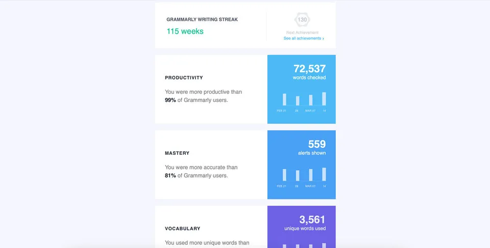
- Number of consecutive weeks of productivity
- Number of words checked/productivity
- Alerts shown/mastery
- Unique words used/vocabulary
Grammarly’s weekly data storytelling emails encourage users to use the tool more to improve their writing, ultimately increasing product usage and engagement.
How can your product leverage data storytelling to increase engagement?
- Start by interviewing your target audience to learn what information they value most–try to identify something that will help them improve.
- Gather a cross-functional team, including content designers, product managers, marketers, data scientists, and engineers, to ideate how to present personalized data.
- Create fully-functioning high-fidelity data visualization prototypes for usability testing.
- Launch a beta version, and get feedback from end users.
- Improve and iterate!
Data storytelling resources:
- What is data storytelling?
- Data Storytelling: How to Effectively Tell a Story With Data
- Introducing Grammarly Insights (example of data storytelling from Grammarly)
- How to Tell a Story With Data: A Guide for Beginners
- The next chapter in analytics: data storytelling
Minimalism
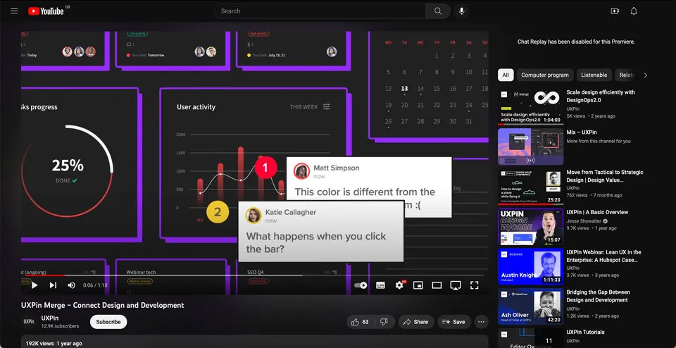
Minimalism is a trend that keeps on trending! YouTube refreshed its user interface design for a more modern, minimalist black and greyscale look in mid-2022. The old YouTube-red subscribe button is now black, and secondary CTAs are black on grey.
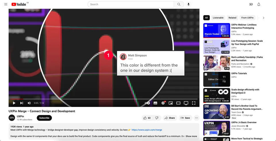
YouTube’s black and greyscale UI facilitates a seamless user experience between light and dark themes–dark mode is a trend that’s grown in popularity over the last few years.
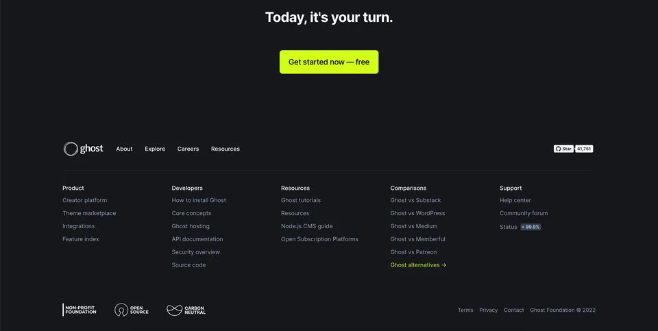
Many websites and digital products have adopted a similar black and greyscale variation. The benefit of this simple color palette is UI designers can use a single color to make important CTAs and features pop–like this example from the blogging platform Ghost.
Minimalism resources:
- How to Use Minimal Design to Create Practical Design Systems
- 3 Techniques for the Perfect Minimalist Web Interface
- A Perfect UI Pairing: Minimalism and Bold Typography
- Free e-book: Space, Ratios, Minimalism in Web UI Design
- Simplicity Is Key: Exploring Minimal Web Design
Buttonless User Interfaces
Continuing the minimalism trend are buttonless user interfaces–say what? Buttonless UIs are more common than you think. Most mobile devices use buttonless patterns for settings.
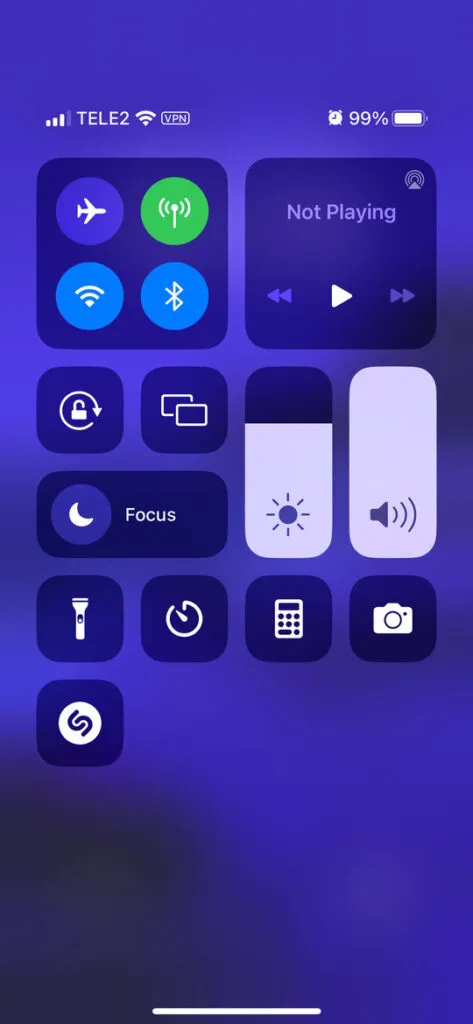
For example, users can adjust these iPhone settings using tap, slide, and swipe gestures. Instead of a + and – for volume and brightness, users slide either component up or down to adjust.
“Having a single action that has a clear outcome is an awesome invention but it’s pretty outdated, told us Piotr Makarewicz, Director Of Product Design at Pitcher AG. “We have many other ways of interacting – day to day we use voice, with our loved ones we can use touch, in a restaurant we use smell and taste.
Voice seems like the most natural communication device we have. We use that for our assistants and to control some home smart devices but it’s still pretty awkward. It’s great that Siri can rap but she is not a real day to day assistant. Neuralink is still far away and who’s to say that it wouldn’t be even more awkward.
When it comes to Buttonless Interfaces it’s not about changing the light switch to a clapper switch, it’s about making the light smart enough to light itself exactly when it’s needed.”
Buttons are often redundant in most UI patterns. For example, if a card only has one action, it doesn’t need a button; users can click/tap the card.
Other examples where designers can eliminate buttons include:
- Using a devices biometrics to replace login forms
- Leveraging voice search/voice user interface (VUI) functionality
- Dragging or swiping messages and popups to close them
- Double tap to like or favorite
- Using device a device’s return key to replace send buttons for text fields
Buttonless UI resources:
VR & AR UI Design
Whether you believe in Meta’s Metaverse prophecies, demand for VR (virtual reality) and AR (augmented reality) user experience design continues to grow.
“We as designers need to be aware of that and make sure that we have our voices heard, noticed Piotr Makarewicz (Pitcher AG), “It’s something that can affect the landscape dramatically and we still are not ready for it. With new initiatives like Live Translator with Subtitles or virtual universes popping out you know there’s something out there. It’ll no longer be just Jarvis inside (or outside) Iron Man helmet or us furnishing homes with IKEA AR, it’ll stop being just a novelty and will become a necessity.”
VR & AR have expanded beyond gaming and social interactions to developing tools that help users navigate the real world better. For example, many companies use AR systems to train employees.
Retail brands are also using VR to create apps that enable users to try their products:
- IKEA Place: an AR furnishing app that allows users to visualize how a room will look with products from IKEA. For example, which sofa will look best in your living room?
- Warby Parker: an outstanding AR experience allowing users to try different frames and purchase through the app.
- L’Oréal ModiFace: customers can try L’Oréal’s makeup range to find that perfect shade and tone.
These creative applications show how brands selling physical products can leverage AR and VR technology to enable customers to “try before they buy.”
VR & AR UI design resources:
- 7 innovative cases of augmented reality used in enterprise
- Hyundai Virtual Guide Introduces Augmented Reality to the Owner’s Manual
- For more companies, new ways of seeing
- UI/UX: Designing for AR & VR
- Role of UX UI on Augmented Reality design
Minimum Lovable Product (MLP)
Brian de Haaff, co-founder and CEO of leading product development software, Aha!, coined Minimum Lovable Product (MLP) in 2013 and wrote about it in his best-selling book, Lovability: How to Build a Business That People Love and Be Happy Doing it.
The idea behind MLP is to focus on delivering product experiences customers love rather than getting to market as fast as possible with a Minimum Viable Product (MVP).
What does this mean for UI designers?
“Trendy apps have hooked us on instant, bite-sized gratification, and in the coming year we’ll see more of the minimum lovable product approach as new ideas and innovations emerge – shipping smaller, faster slices to test the market before going all-in. What an exciting time to be a designer (and consumer)! You’ll get to taste-test big ideas and watch them evolve over time.” – Cheryl Couris from Webex Events.
- Focus on accessibility to create fully inclusive user experiences from the start.
- Leverage an open-source design system to build an MLP using tested and approved UI components rather than designing from scratch.
- Use component-driven prototyping to solve usability and accessibility issues while identifying more opportunities during the design process.
With so much competition and new startups entering every market daily, quality UI design will be a significant competitive advantage over the next few years.
Minimum Lovable Product resources:
- What Is a Minimum Lovable Product?
- Minimum Lovable Product: The Evolution Of Minimum Viable Product
- What is a Minimum Lovable Product (MLP)?
- Have you ever heard about Minimum Lovable Product?
- What is a Minimum Lovable Product and How to Build One?
2023 Typography Trends
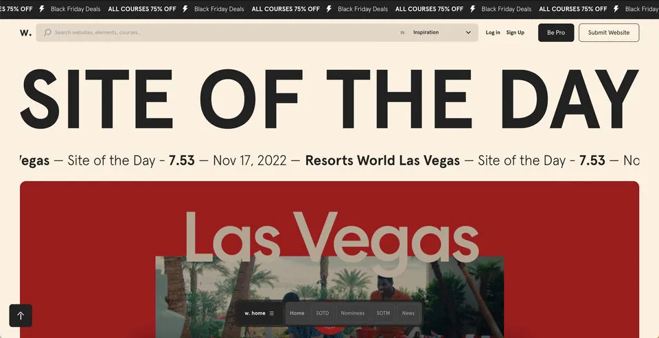
Big, bold, and capitalized appears to be the biggest typography trend for 2023–a fantastic strategy for UI designers looking to grab users’ attention. Even the global web trends website, Awwwards, uses capitalized bold typography for its homepage H1 and header callout.
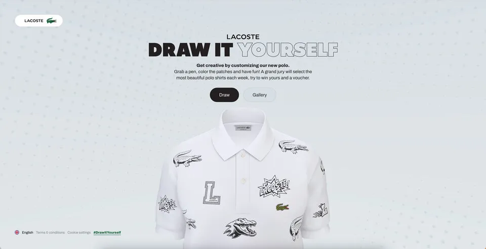
UI designers also mix typefaces and styles to emphasize words or draw users’ attention. For example, this hero from Lacoste’s Draw it Yourself campaign uses bold capital styling combined with solid and outlined text for its H1.
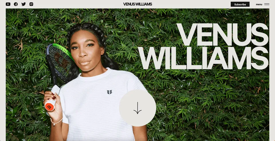
Tennis star Venus Williams also uses big, bold, capitalized typography throughout her website. The font helps reinforce Venus’ status as a strong, dominant world number one.
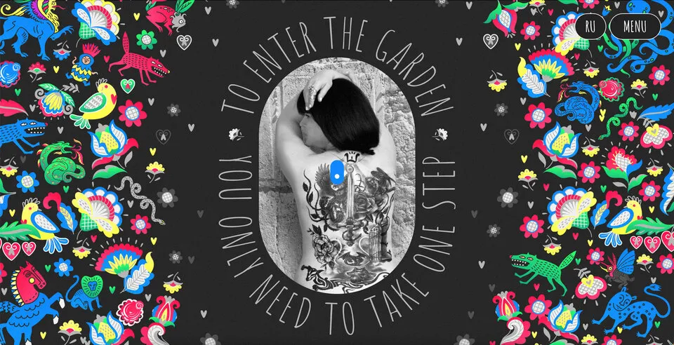
If you want to stand out and position your brand as a dominant market leader, big, bold, capital typography can help achieve that in 2023! For a softer, calmer approach, you can use thin, condensed, and capitalized lettering–like this example from the Aussi-based creative initiative Hip Opera.
Typography resources:
- 25+ Typography Trends for 2023
- Top 10 Typography Trends in 2022
- Typography Trends in 2022: What Should You Know?
- What Are the Graphic Design Trends for 2023?
- 10+ Trends for Pairing Fonts in 2023
Advanced Microinteractions & Animations
Microinteractions breathe life into digital products. Technological and performance improvements over the last few years mean that designers can add these subtle animations to every component–giving UIs more character and personality.
Advanced microinteractions provide vital user feedback, particularly for buttonless UIs where components must respond to user actions. Returning to our Apple example, notice how each UI element animates to inform users of system changes. Turning flight mode on and off triggers multiple microinteractions, running until the system executes the task.
With advances in AR, VR, wearables, and even holographic UIs, we’ll see exciting changes during 2023/24 in how users interface with technology and the microinteractions that facilitate human-to-computer interaction (HCI).
Check out microinteractions resources:
- What is Interaction Design?
- Powerful Microinteractions to Improve Your Prototypes
- Microinteractions: Designing with Details (book by Dan Saffer)
- The Design of Everyday Things (book by Donald A. Norman)
- Interaction Design Trends: 11 Microinteractions Deconstructed
Take your UI design to the next level with UXPin–the world’s most advanced design and prototyping tool.
Improve user testing and get meaningful stakeholder feedback with fully interactive prototypes that look and feel like the final product. Sign up for a free trial to explore UXPin’s advanced prototyping features.
