UXUI PRODUCT GURU

YOLO BANKING – Vietnam’s first digital bank


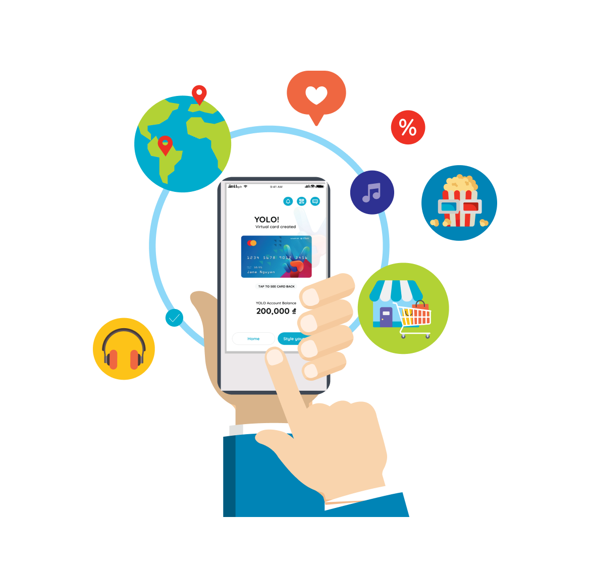
Yolo is Vietnam’s first digital bank. Yolo is an innovative digital bank integrated with sophisticated tools for the young generation, which users can access not only daily services such as taxis, movies, hotel bookings and food and beverage orders, but also banking services including savings and loans associated with Master Card.

Platform

Mobile
Email
Packaging

Role

UI Design
UX Researcher
Market Research

Year

2018 – 2019


MY RESPONSIBILITIES

  • Conducting the production in the final stage, operating updates and usability testing.

  • Taking care of most visual effect and UI screens.

  • Managing design process and schedule, applying User Center Design with Business Mindset and Customer Approach to bring the friendliness problem-solving experiences.

  • Created interactive wireframes, high level designs and other artefacts to share with stakeholders and test with customers

  • Working directly with Product Owners and other related departments to deliver the UI design to put into production

  • Keeping Design System building and GUI for the total product

DESIGN GOAL

DEVELOP UX SAVING PRODUCTS

The global banking sector recently suffered from low-interest saving rates,
therefore, require innovative solutions to encourage savers back into the market and save money.

Problem Statement

The global banking sector recently suffered from low-interest saving rates, therefore, require innovative solutions to encourage savers back into the market and save money


Research Method

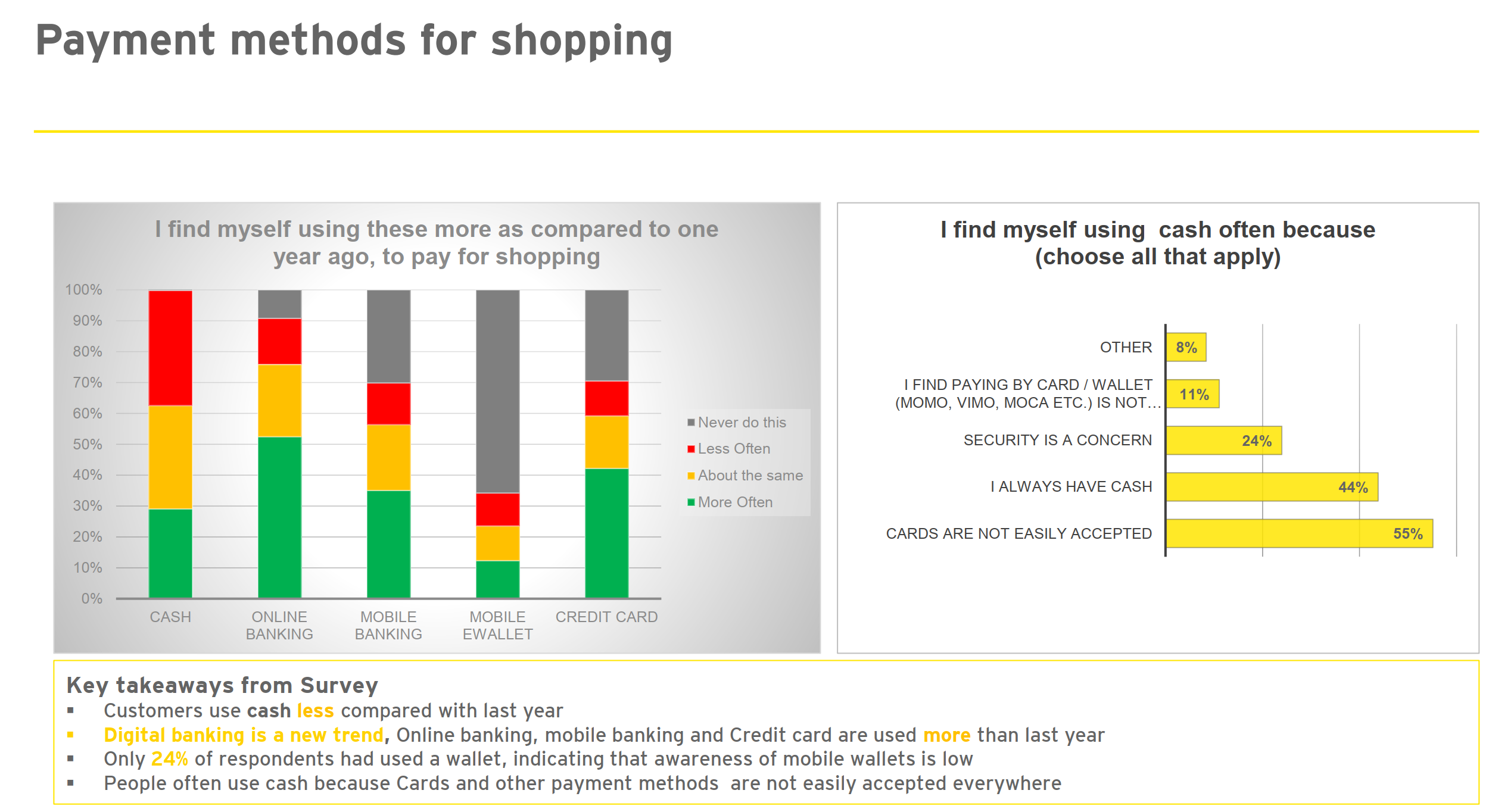
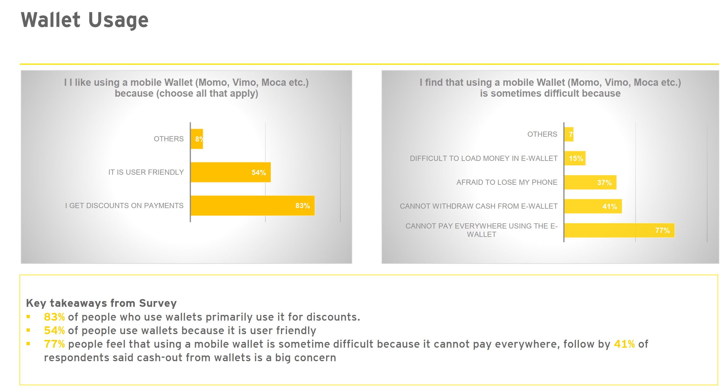
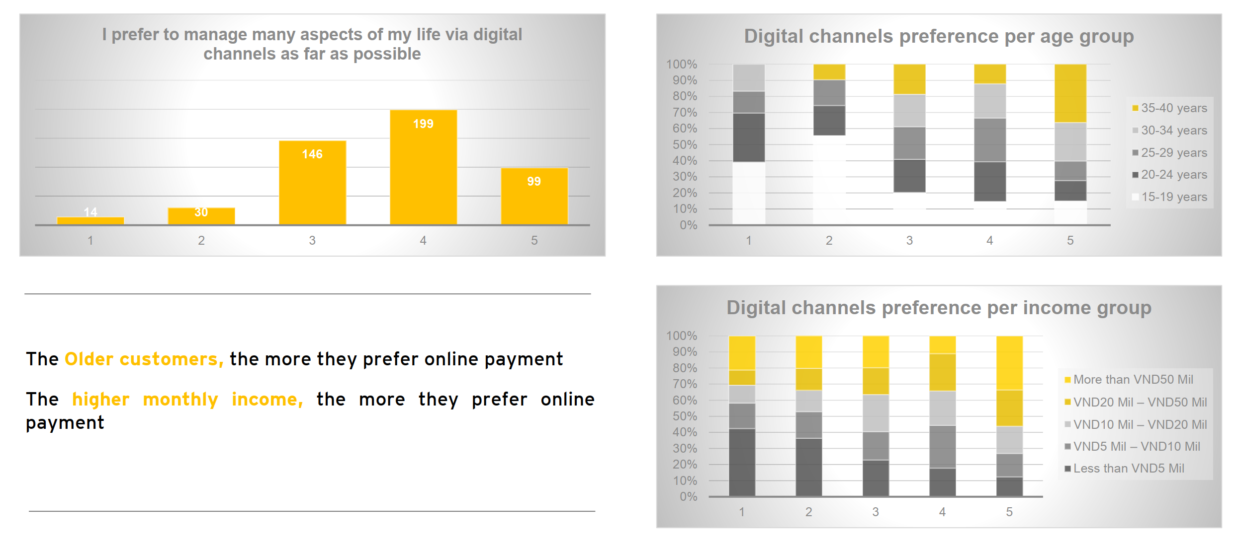
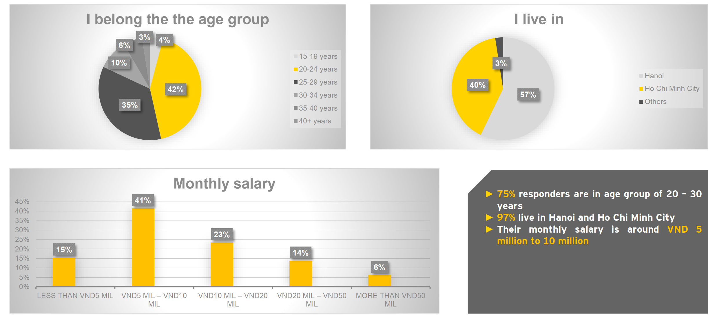
To identify current problems with the app. We conduct research on both sides from the organization to our customer

Customer interviews

Customers can purchase almost any financial product.

Market research analysis

Customers could not know the total money they have when they look at account management

Customer journey

Prototype testing

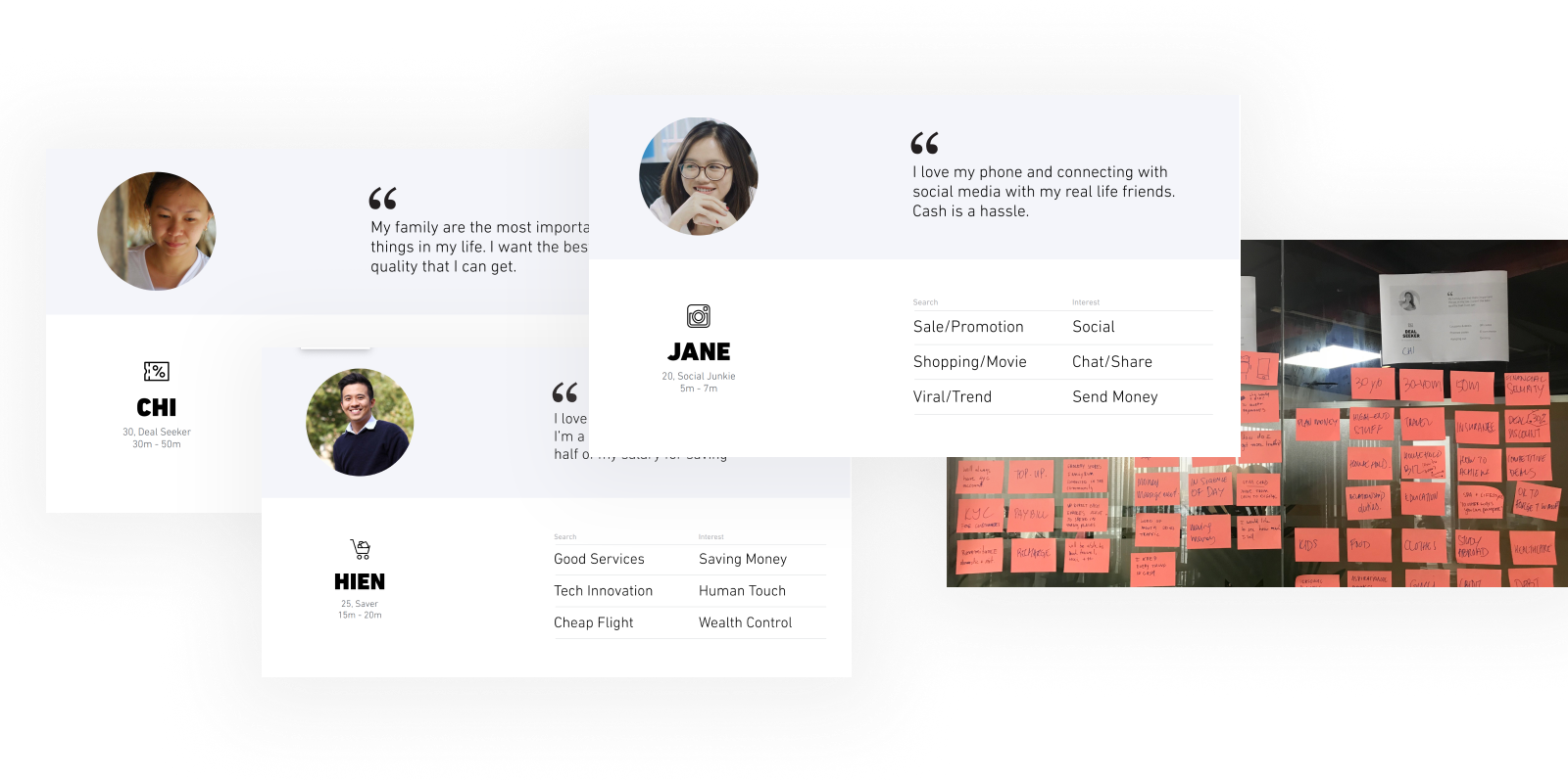
Persona

Information Architecture

In depth interview with front line staffs (Bank teller, call center, customer services and marketing). Review customer online feedback survey 
Conduct usability testing and field study with current customers
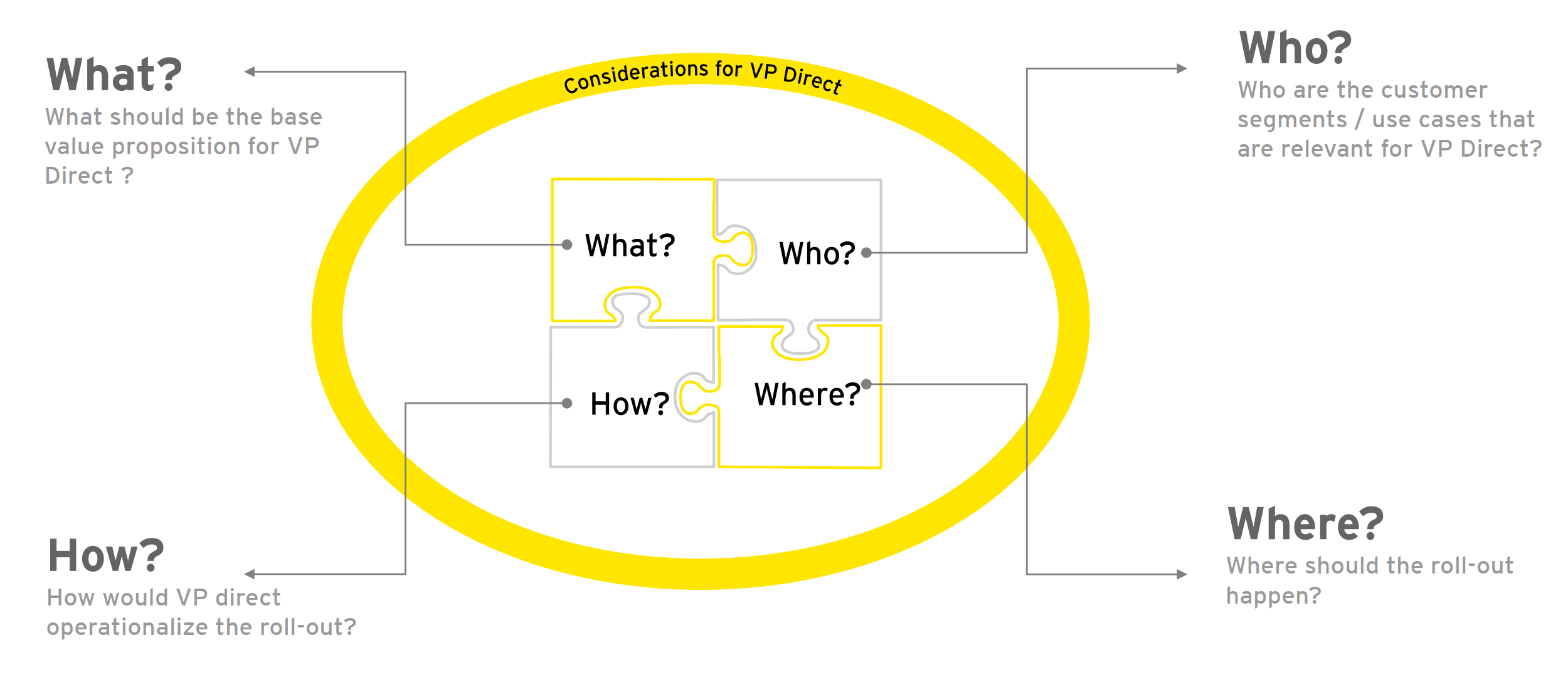
Our Approach

The hardest part of the UX is not selling certain services,, but to educate non-user to know and comprehend clearly about the
products. Customer Journey map give us adeep insight of their journey, in order to figure out where are the touch points that we can reach
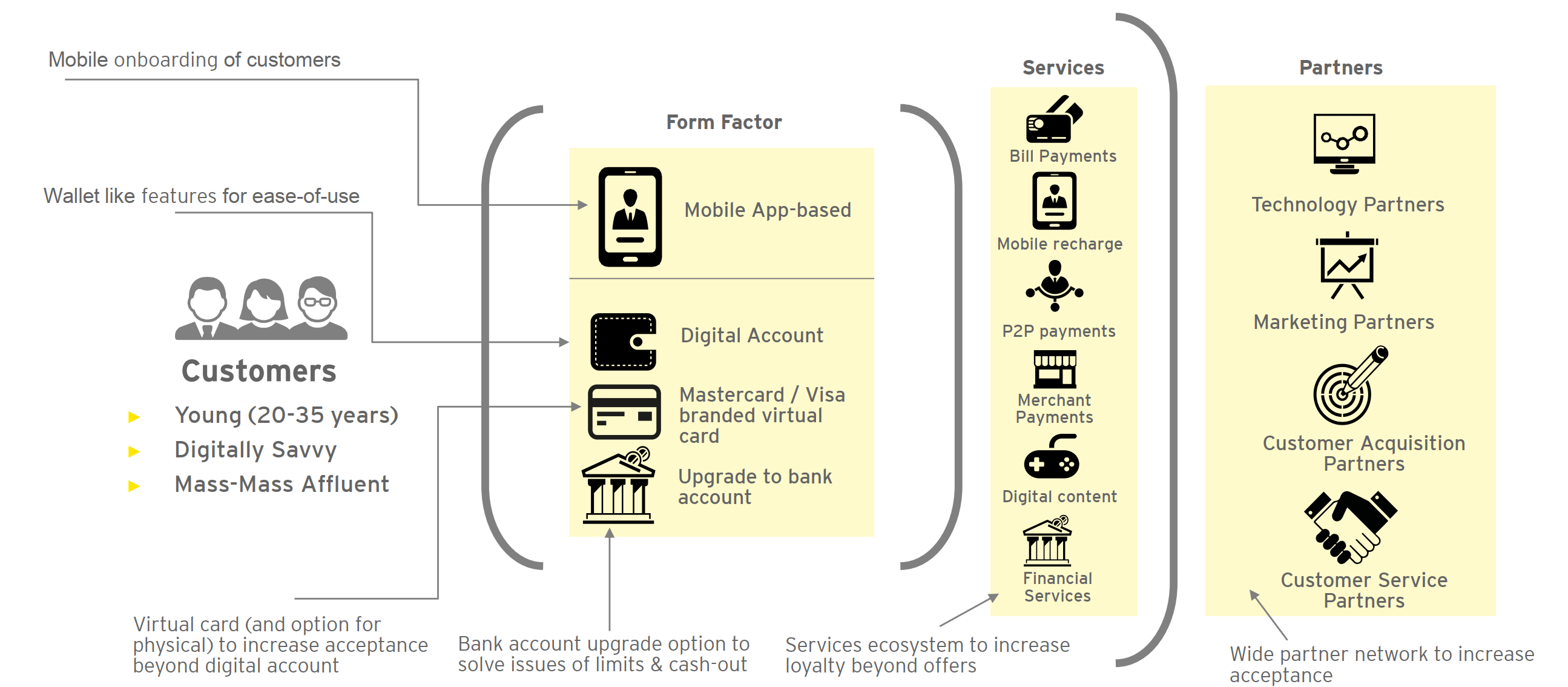
Digital Channel Experience Design

Base product proposition is a “Digital Account”, with the digital account, a customer can easily consume a variety of services.
Customer Journey Map

The hardest part of the UX is not selling certain services,, but to educate non-user to know and comprehend clearly about the
products. Customer Journey map give us adeep insight of their journey, in order to figure out where are the touch points that we can reach
Solution Direction

Optimize the user journey

from the moment of onboarding to when they see the 4 main products.

Improve visual elements

Improve, invoke customer engagement by visual approach instead of long boring page of wording.

Great support

Improve, invoke customer engagement by visual approach instead of long boring page of wording.

Banking First

Frequent banking tasks should always treat as the top priorities .

Following our customer interviews, we synthesized our findings and were able to create a customer journey and persona which were presented and discussed with the client.
These exercises formed a great foundation to move into feature ideation and prioritisation.
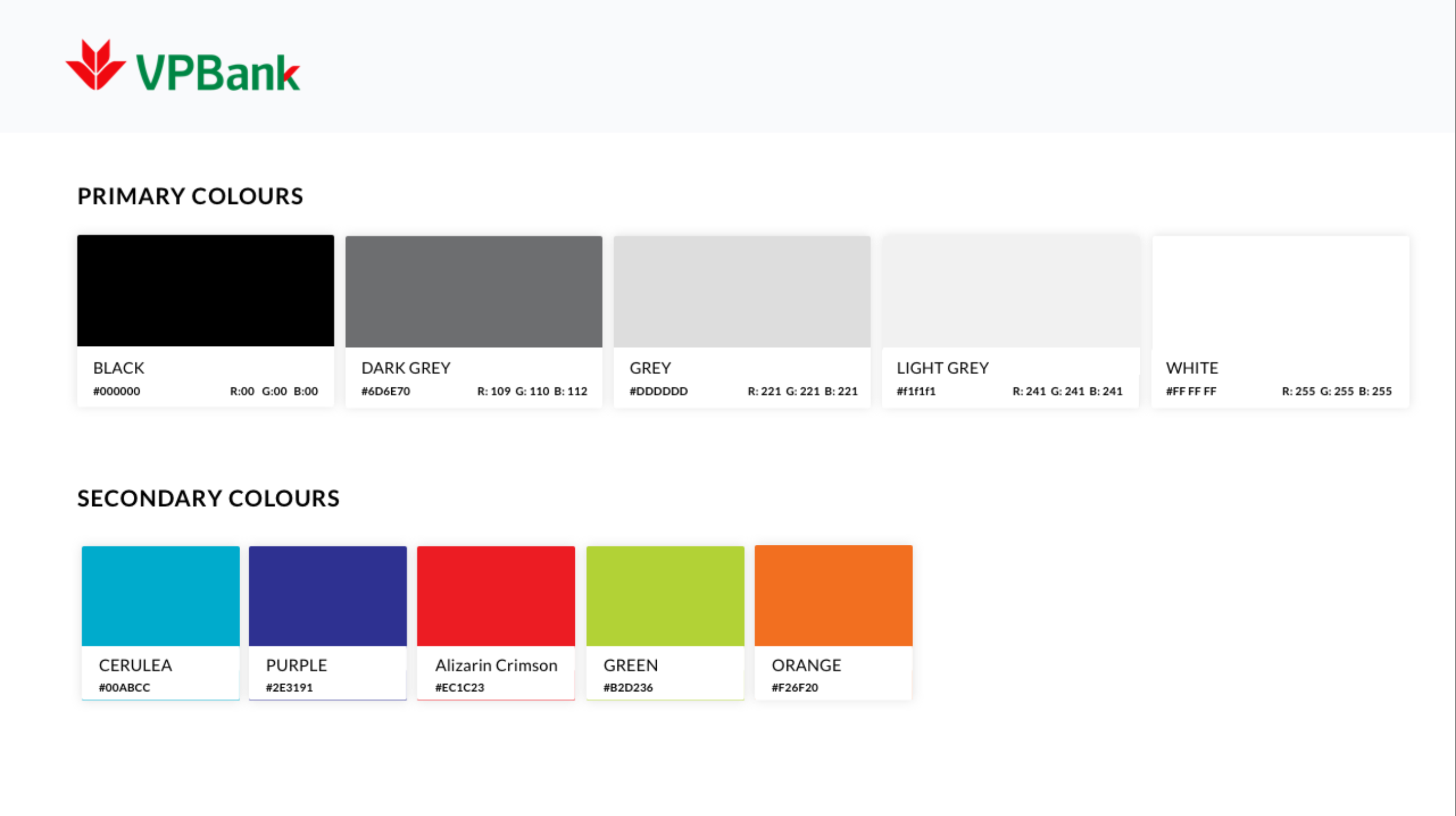
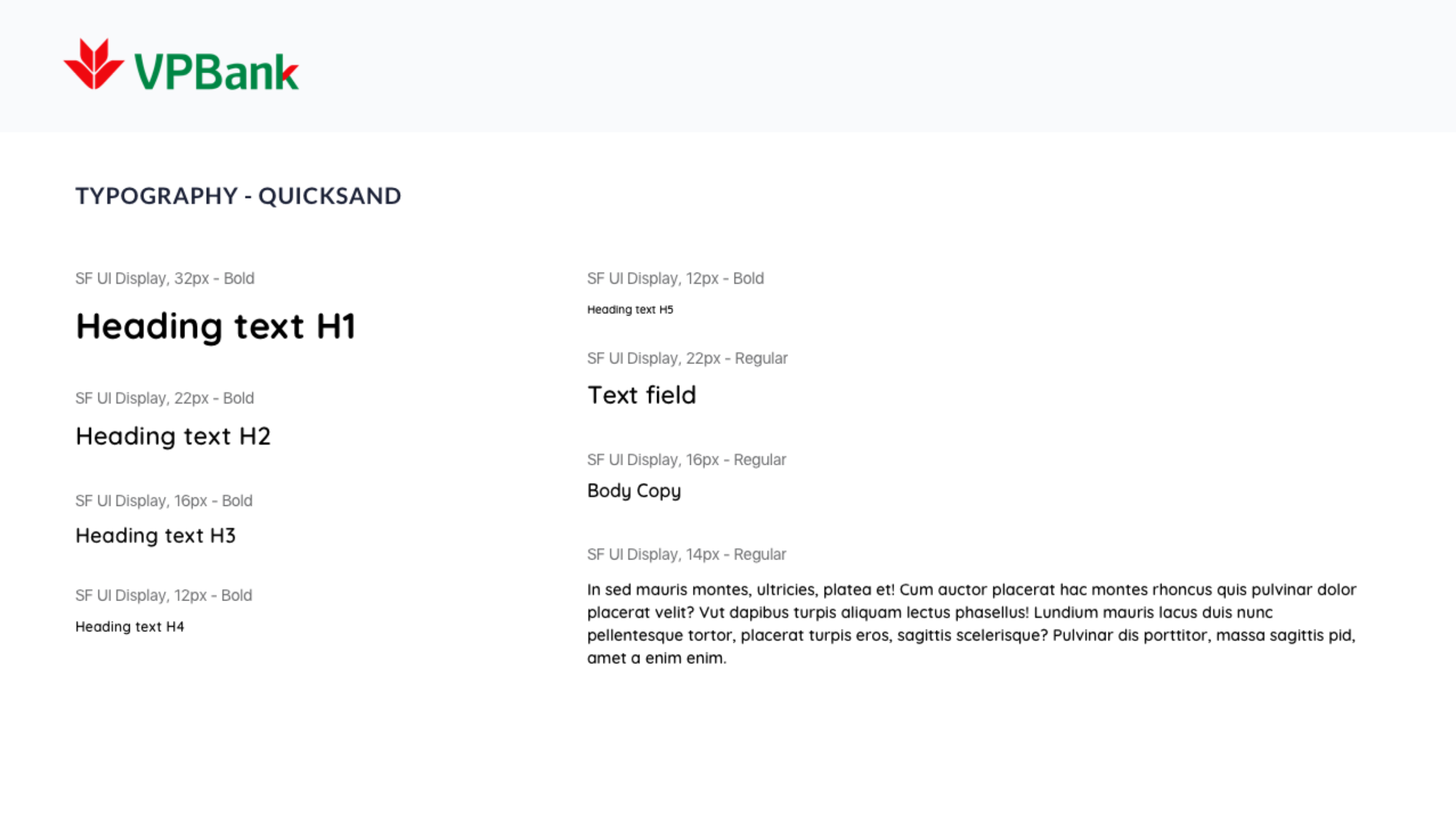
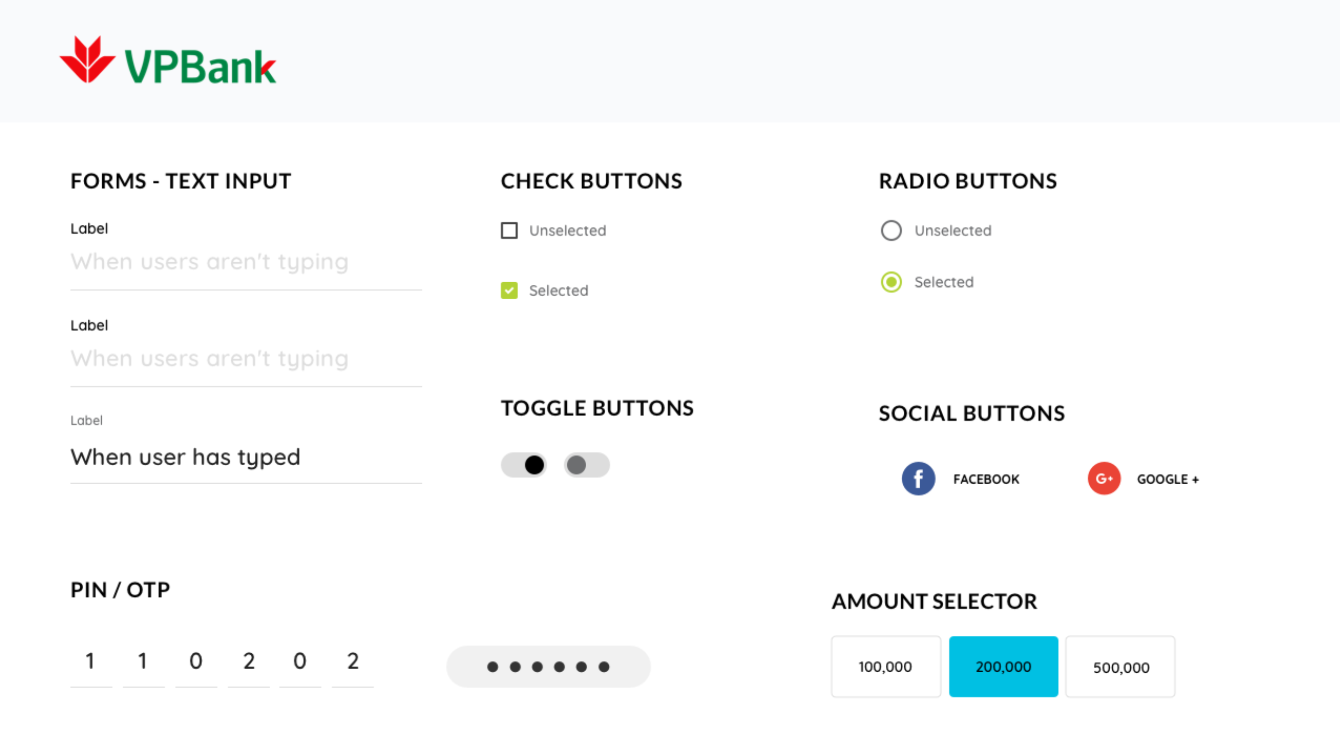
Style Guide

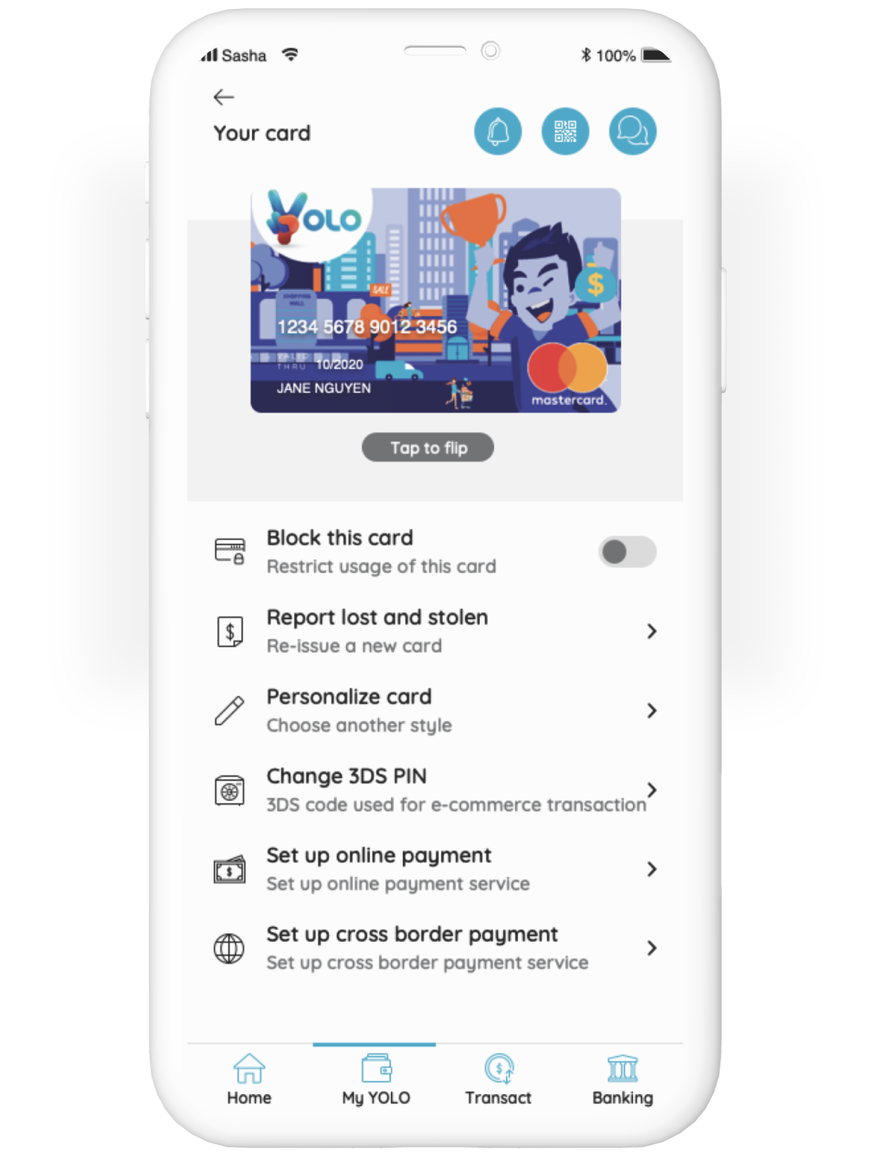
UI Design & Prototype

Designing a flexible set of steps that can capture the amount of data the user feels comfortable submitting—prioritising name, email and password fields—while leaving the door ajar for a customer to skip at any time.

UI Design & Prototype

Designing a flexible set of steps that can capture the amount of data the user feels comfortable submitting—prioritising name, email and password fields—while leaving the door ajar for a customer to skip at any time.

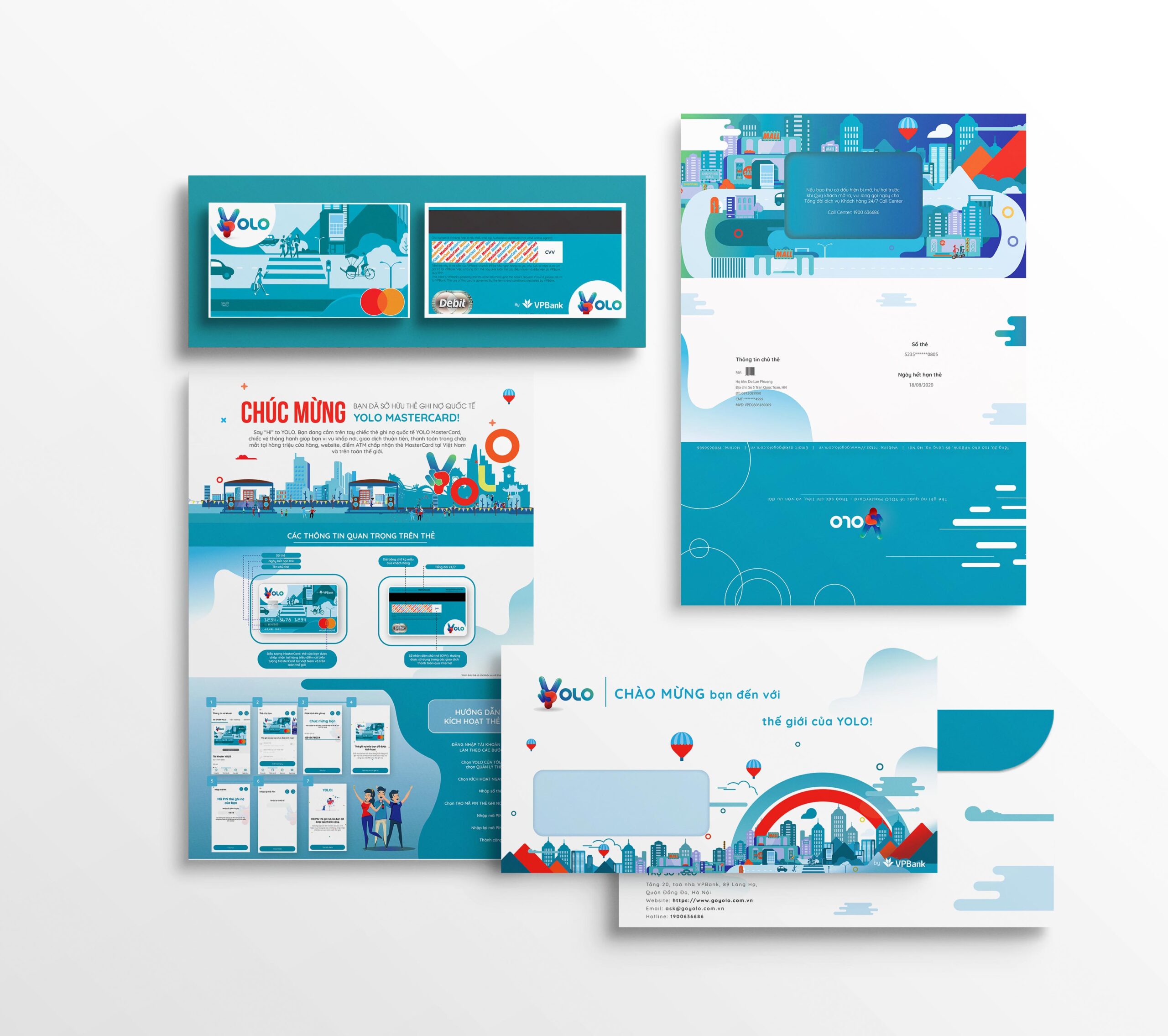
Packaging

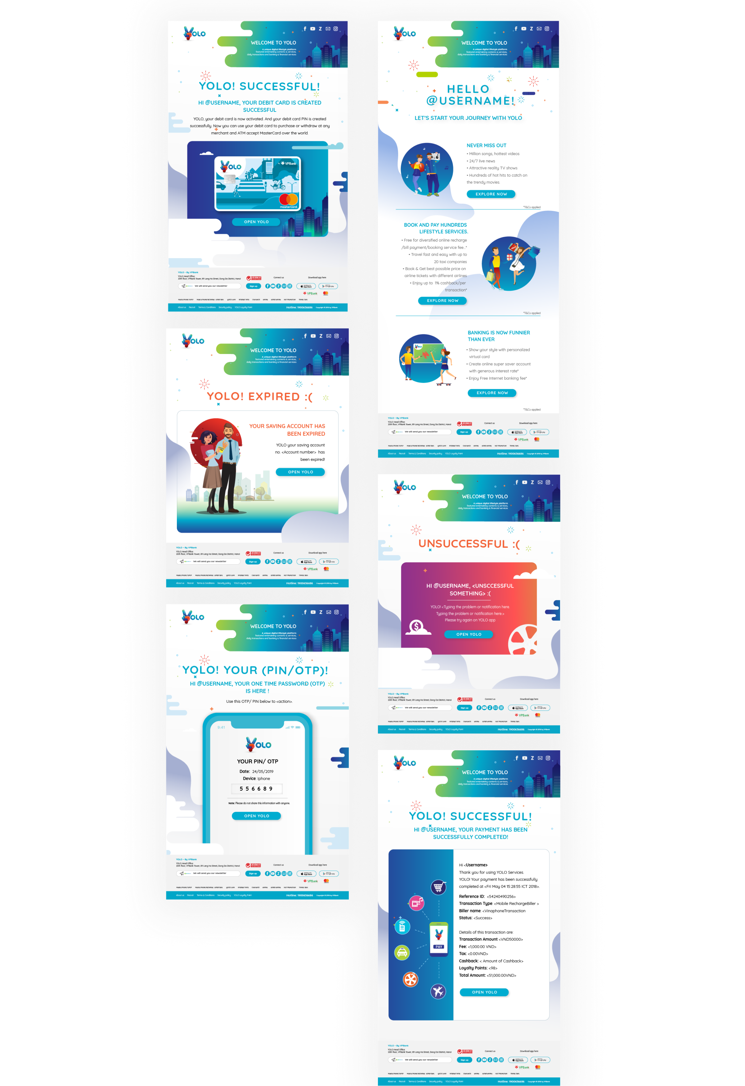
Life cycle emails

Learning

With the pressure of a tight budget and deadlines, it was extremely hard for me when running this project.

Key actions should always highlight

Allow users to consume information seamlessly.

There’s nothing such details in the detail screen

Make it easy to understand.

Design for scanability

Highlight key actions support scanning.

The hook must be charming

The most important account must standout. Easy to see, easy to access